Your sales funnel, transparent in both directions.
Most sales funnels only run one way: activity goes in the top, revenue comes out the bottom, and the middle is a guess. This one runs both ways. Read it forward and you see which outreach activities actually materialized into closed-won opportunities. Read it backward and every won dollar traces to the first touch that sourced it, through each stage it cleared on the way. Inputs to outputs, outputs back to inputs, with the lineage visible at every step.
That is the idea: full transparency of the sales funnel, end to end, so a sales organization can see exactly where pipeline comes from, where it stalls, and which efforts actually pay off. It turns attribution from a number nobody can defend into a lineage anyone can follow, which is what brings clarity and accountability to the pipeline. See it live here. The rest of this post is how it works, and why the attribution underneath it holds up.
Lead sourcing is usually a black box
Open almost any CRM and "lead source" is a single dropdown field. Someone picked it once, by hand, the moment the record was created. Then it gets rolled into a pie chart and presented as if it were measured. It looks authoritative. It is a guess nobody can see behind.
That is the real gap. The number is not untrustworthy because the math is wrong. It is untrustworthy because the rule that produced it is invisible. You cannot ask "why is this deal a Referral?" and get an answer, so you cannot audit it, argue with it, or improve it. The box stays shut. And you are about to set quotas and budgets on top of it.
Do not stamp attribution. Derive it.
So I did not stamp a source onto anything. Activities in this model are logged where they actually happen in the real world: against contacts, not opportunities. A rep logs a call, an email, a webinar signup on a person. Nobody fills in "this is the activity that sourced opportunity #4471," because in real life nobody knows that at the time.
The link between activity and opportunity is then derived, by one rule you can read in full:
- An activity can only influence an opportunity at the same account. Outreach to one company does not get to claim a deal at another.
- It has to land in the 60 days before the opportunity was created. Work after the deal already existed did not source it, and work from two years prior is not why it opened now.
- When several activities qualify, first touch wins the credit: the earliest one in that window.
In DuckDB that rule is a join. This is the literal definition of "qualifying activity," and it is the whole attribution model in seven lines:
-- An activity influences an opportunity only if it happened
-- on a contact at the opp's account, inside the 60 days
-- before the opp was created. Nothing is stamped onto the opp.
-- The link is earned by this join, or it does not exist.
CREATE TABLE qualifying AS
SELECT o.opp_id, a.activity_id, a.channel, a.activity_date
FROM opportunities o
JOIN contacts   c ON c.account_id = o.account_id
JOIN activities a ON a.contact_id = c.contact_id
WHERE a.activity_date
      BETWEEN o.created_date - INTERVAL 60 DAY
          AND o.created_date;
First touch is then one window function over that table. The detail that matters most is in the comment:
-- First touch wins the credit: the earliest qualifying activity.
-- An opp with no qualifying activity falls through to 'Unattributed'.
-- It is not forced into a bucket to make a chart look complete.
CREATE TABLE first_touch AS
SELECT opp_id, channel AS source
FROM (
    SELECT opp_id, channel,
           row_number() OVER (PARTITION BY opp_id
               ORDER BY activity_date, activity_id) AS rn
    FROM qualifying
)
WHERE rn = 1;
An opportunity with no qualifying activity does not get assigned a convenient source. It becomes Unattributed, and it stays that way, visible on the chart. In this dataset 60 opportunities land there. A dashboard that buries them is not more accurate, it is just more confident than it has any right to be.
One caveat: this rule is a set of choices, not a law of nature. The 60-day window, the same-account scope, the first-touch credit: each one has to fit how your company actually sells. Sixty days suits the deals modeled here, but a long enterprise cycle might want 180, a fast transactional motion 14, and a partner-led business might spread credit across every touch instead of giving it all to the first. The exact thresholds are not the point. The point is that the attribution logic is explicit and visible, so it can be defined to match the business and argued with in the open, instead of guessed once and buried in a field.
Honest attribution says only 1 in 5 activities matters
Deriving attribution instead of stamping it changes the story in ways a dropdown never would. The headline: of 30,000 logged activities, only 5,804 (about 19%) actually influence any pipeline under this rule. The other four-fifths are real work that never qualified: prospecting into accounts that did not open a deal, follow-ups after the fact, touches outside the window. That is not a bug to tune away. It is what activity data looks like when you are honest about it.
And once you can trust where deals come from, the channel comparison becomes worth betting a budget on. Effort rises and win rate falls cleanly down the channel ladder:
| Channel | Activities per opp | Win rate |
|---|---|---|
| Referral | 3.5 | 26.2% |
| Inbound Web | 3.6 | 19.3% |
| Webinar | 4.7 | 13.7% |
| Email Outreach | 6.3 | 5.7% |
| Event | 6.7 | 3.0% |
| Cold Call | 9.1 | 1.1% |
Referral closes at 26.2% on about three and a half touches. Cold Call takes nine to close at 1.1%. The two low-effort channels, Referral and Inbound Web, drive 77% of all won revenue. That is a real reallocation decision sitting in the data, and you would only bet a budget on it if you trusted how the sources were assigned in the first place. Which is the point of all the work above.
The whole pipeline is four tables and some SQL
None of this needs a warehouse bill or a BI seat. The stack is the same $0 open-source pipeline I used for the Hawaii fruit app, pointed at a sales problem instead of a foraging one.
- Generate. A deterministic Python script (fixed seed, so it rebuilds identically) writes four Salesforce-shaped CSVs: 300 accounts, 1,211 contacts, 1,500 opportunities, and 30,000 activities. It never stamps an activity to an opp. It logs activity on contacts and lets the truth be derived.
- Transform. DuckDB reads those CSVs and runs the attribution SQL above, plus a handful of GROUP BY marts: the channel scorecard, the stage funnel, the influence rate. The output is one
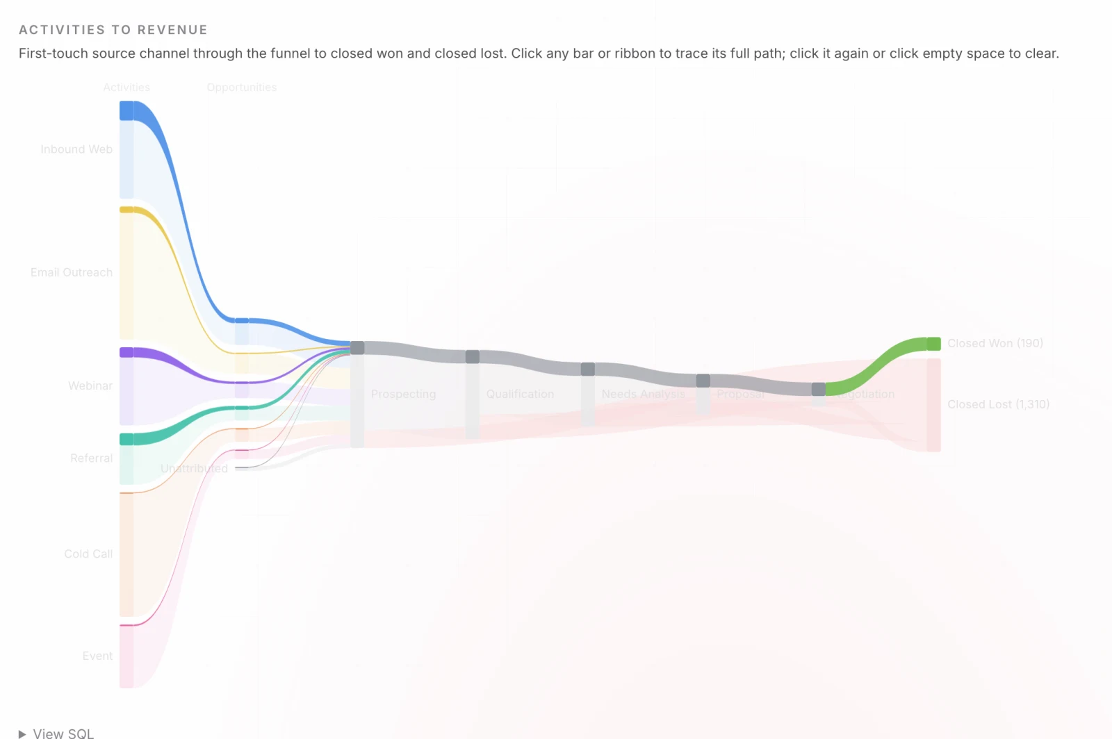
data.json. - Serve. An Astro page reads that JSON. The Sankey is hand-rolled SVG, no chart library. Six channels taper from a sourcing-activity column into the opportunity funnel, the funnel narrows across five stages, and pipeline splits into closed-won and closed-lost.
Because the deal value is conserved, the diagram switches between counting opportunities and summing dollars, and in dollar mode won plus lost still equals total pipeline. Nothing leaks.
Transparency is the product, not a footnote
A derived rule is only worth more than a guessed one if you can see it from inside the app, not just in a blog post. So every chart carries its own receipts.
- View SQL on every chart. The Sankey, the channel scorecard, and the drop-off chart each have a "View SQL" panel that regenerates as you filter. Narrow to Enterprise in EMEA and the SQL updates its WHERE clause to match. The number and the query that made it never drift apart.
- Click any slice to trace the full path. Every bar and ribbon is clickable. Click "Closed Won," or "Reached Proposal," or a single channel, and the app lights up the exact subset behind it (which channels fed it, where it stalled, what it closed) over a dimmed view of the whole. You are never told a total you cannot decompose.
- Break it down live. Re-group the source side by Channel, Segment, Industry, Region, or deal size, and watch the same pipeline reorganize. The attribution does not change, only the lens.
This is the bidirectional transparency in practice. Ask where a deal came from and the path lights up: the channel that sourced it, the stage where it stalled, whether it closed. Ask which deals a channel actually produced and the trace runs the other way. Nothing on the screen is a total you cannot open.
A number you can defend changes the pipeline review
Pipeline reviews run on trust. The VP wants to know which channels to fund, the rep wants credit for the deals they actually sourced, finance wants a forecast that holds. The moment attribution is a hand-typed field rolled into a pie, every one of those conversations is built on a number nobody can defend. People stop arguing about strategy and start arguing about whether the data is real.
Transparency dissolves that. When the rule is four lines of SQL on the screen, you can disagree with it productively. Maybe 60 days is too short for your sales cycle, or last touch fits your motion better than first touch. Fine: now you are debating the model out loud, changing one line, and watching the whole funnel respond. That is a far healthier place to be than trusting or distrusting a black box. A definition you can see is a definition a team can actually agree on.
And the honesty cuts both ways. Showing that only 19% of logged activity influences pipeline, and that 60 deals are genuinely Unattributed, is not weakness. It is the credibility that makes the other 81% of the story worth believing. A number you can trace is a number you can stake a budget on.
The funnel is live here. The data is invented, but the pattern is the one I would bring to a real revenue team: derive attribution from the activity that actually happened, put the rule on the screen next to the number, and let anyone click their way back to the source. That is the difference between a dashboard people believe and one they argue with.
Josh
If your pipeline numbers spark arguments instead of decisions, we build attribution your team can audit down to the SQL. Senior talent. AI-native delivery.